RTD Rebrand
This rebrand concept for the RTD (Regional Transportation District) was born from my daily commute. As a regular rider across the Denver, Aurora, and Boulder areas, I saw an opportunity to modernize the visual identity of the system that keeps Colorado moving.
My goal was to revamp the branding to feel more intuitive, clean, and reliable—reflecting a transit authority that is as efficient as it is essential. This project reimagines the RTD not just as a utility, but as a sleek, cohesive part of our city's modern landscape.
Keywords Dependable, safe, trustworthy, efficient, professional

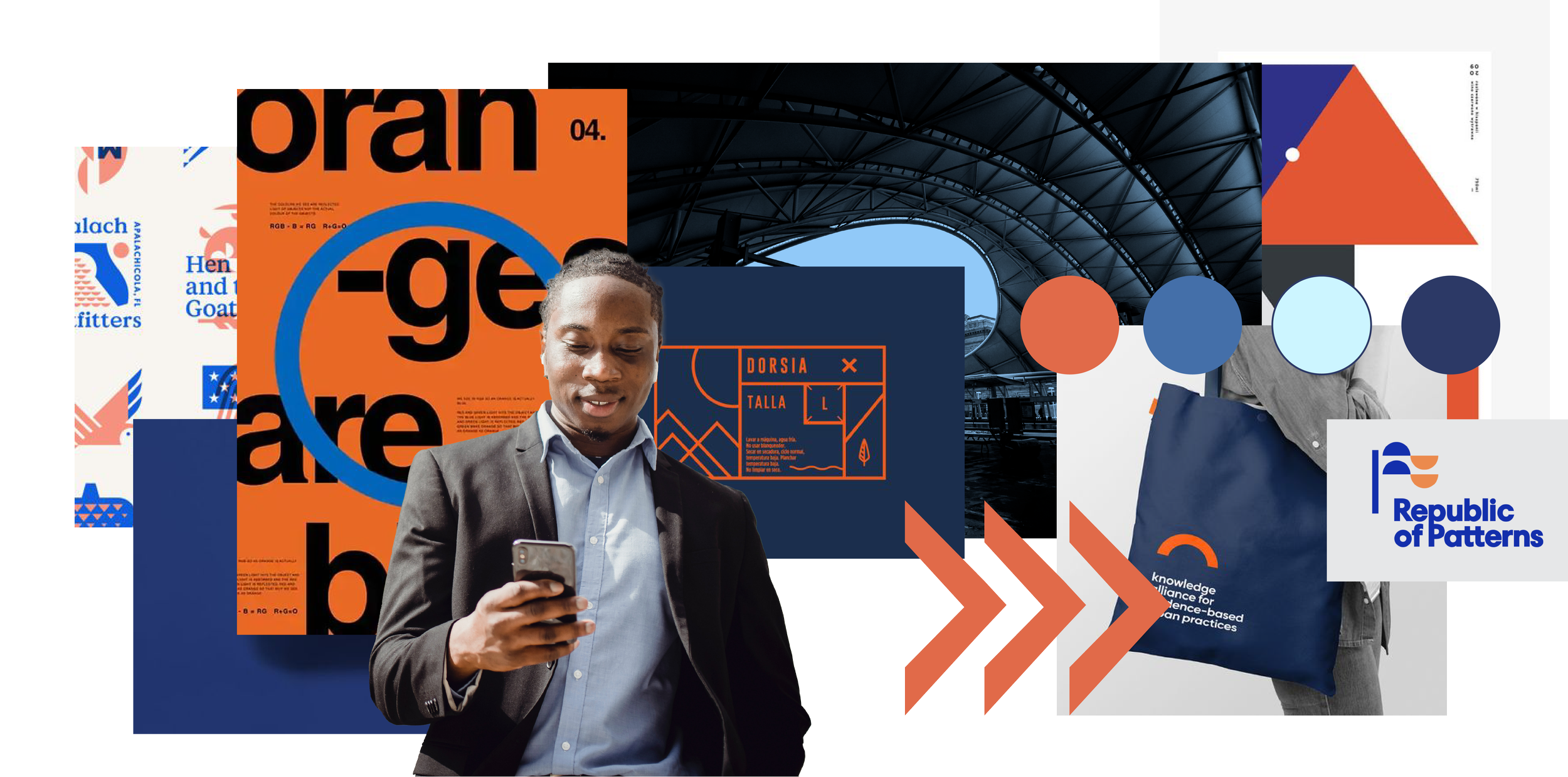
MOODBOARD
This mood board represents the foundation of the RTD rebrand. I chose a palette that stays true to Colorado’s roots, pairing calming blues with a bold, energetic orange.
The goal was to create a visual system that feels both dependable and professional. By mixing clean, modern layouts with these iconic colors, the branding feels more trustworthy and organized—qualities that are essential for a transit system that people rely on every day.
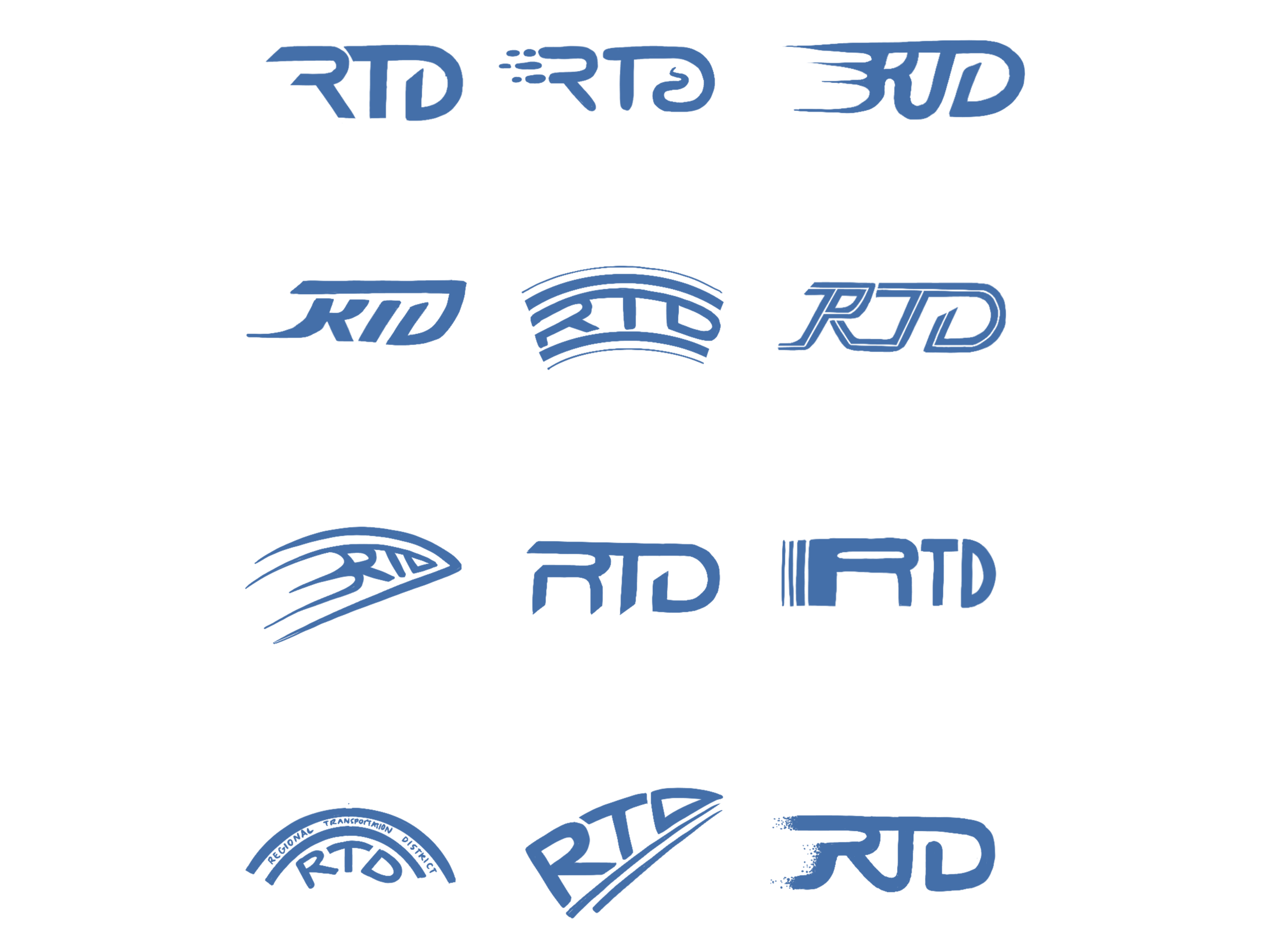
SKETCHES
After researching and creating a pinterest board, I dove into sketches. I really wanted the new logo to have a bit of motion in it. I tried to play around a lot with how the letters connected and how I could depict travel with it.

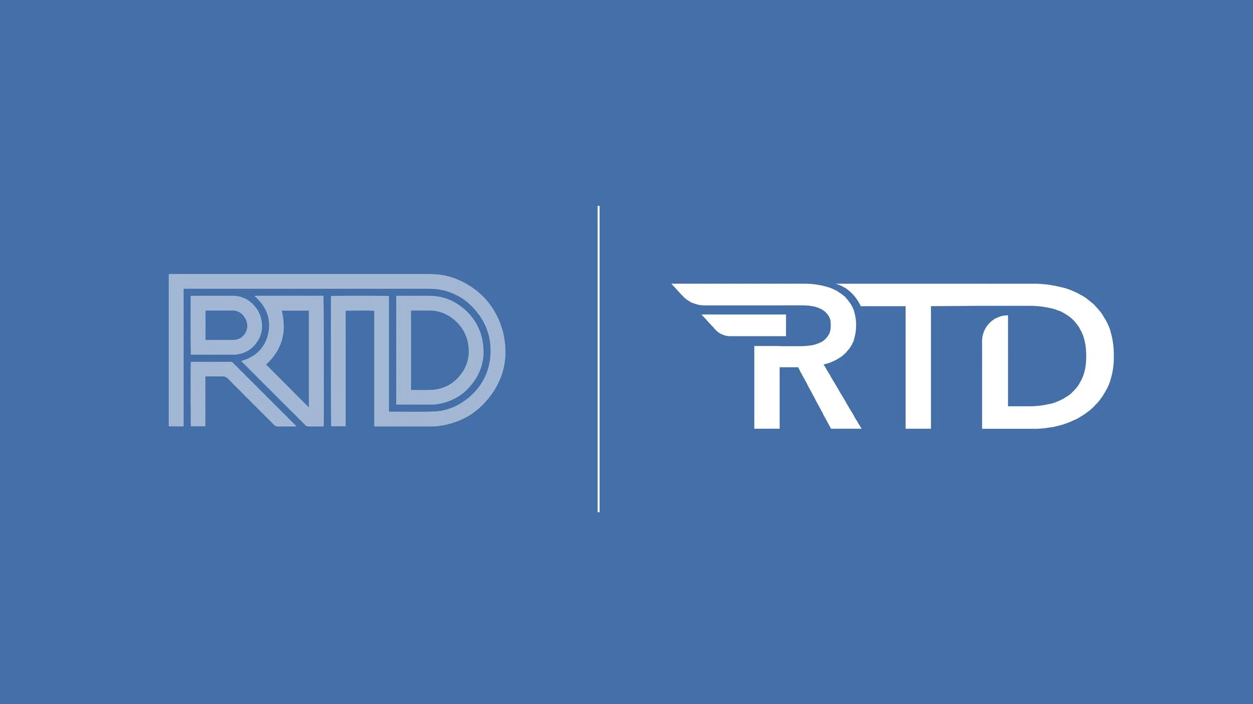
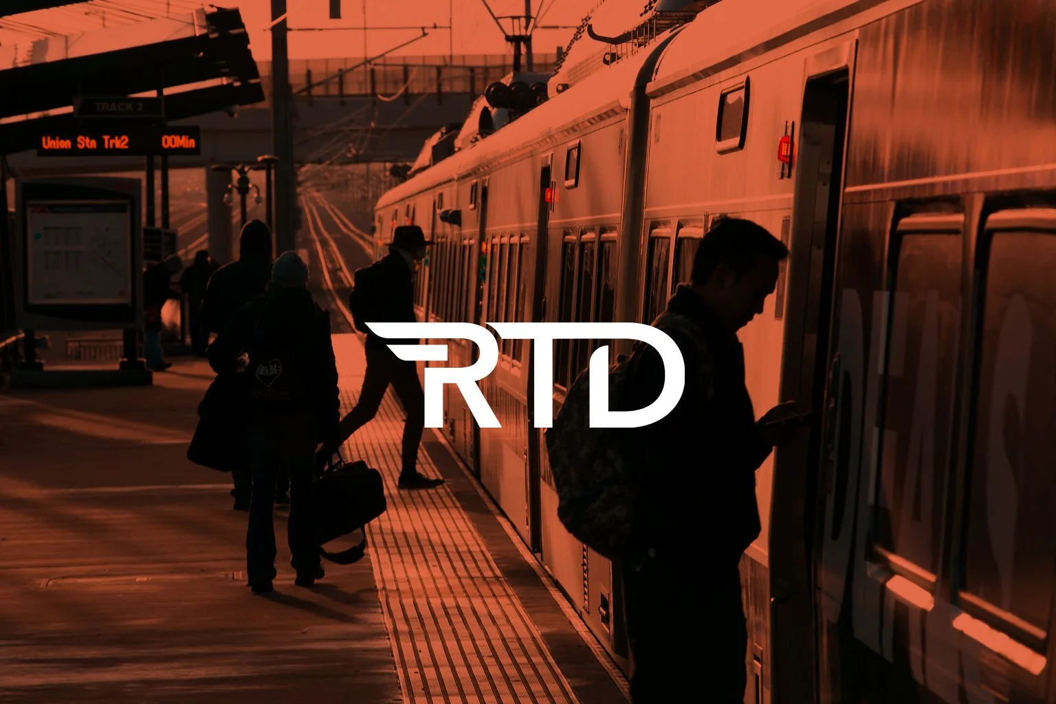
THE LOGO
On the left is the old logo and on the right is the logo I ended up going with. I wanted to keep the new logo bold and simple so it would be long-lasting.

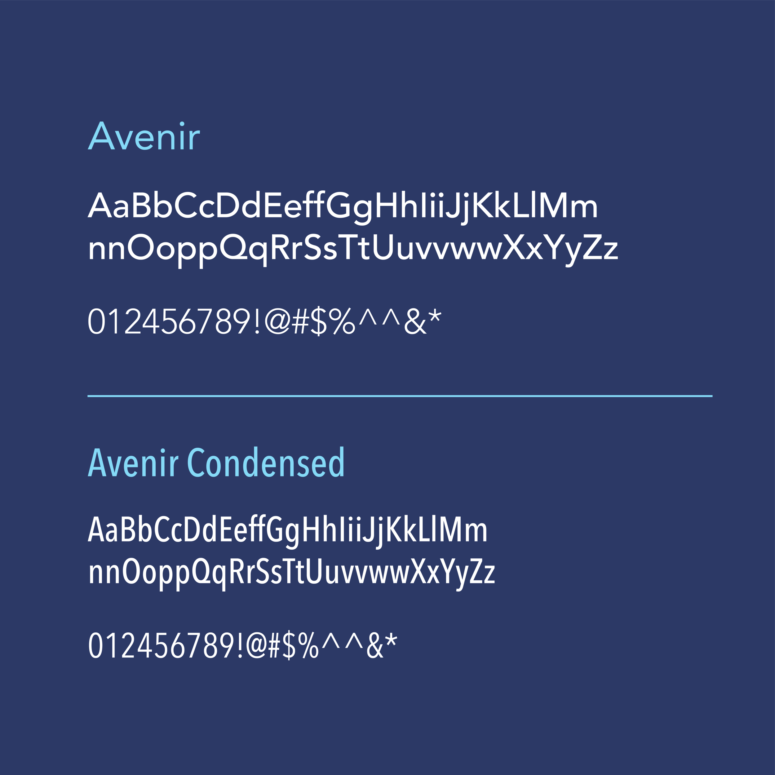
TYPOGRAPHY & COLOR
For typography, I wanted to choose a typeface that was universal, clean, and overall easy to read. I ended up going with Avenir because of how many weights it had and felt it matched the brand nicely. As for color, I chose some calming blues and a bright orange to contrast it.