Terra Vista Branding
This is the branding I came up with in collaboration with latitude Studio for Prajna Yoga. Prajna Yoga is a yoga studio and retreat center based in the foothills of Santa Fe, New Mexico. Their name “Prajna” means insight, deep understanding, and mindfulness. They believe yoga is a profound journey inward and supports their students to explore the healing arts of yoga.
KEYWORDS Natural, Humble, Elegant, Honest, Warm
MOODBOARD
This is the initial mood board I created for the brand. They were looking for a simple and modern look that would appeal to younger audiences. They also wanted to incorporate the aesthetics of Japanese temples, architecture and packaging into their brand.


The Logo
This is the final logo we came up with. The intention for the logo was to feel elegant and minimal.
COLOR
The combination of browns, tans, greens, and blues represents nature, wholesomeness, growth, purity, and elegance.

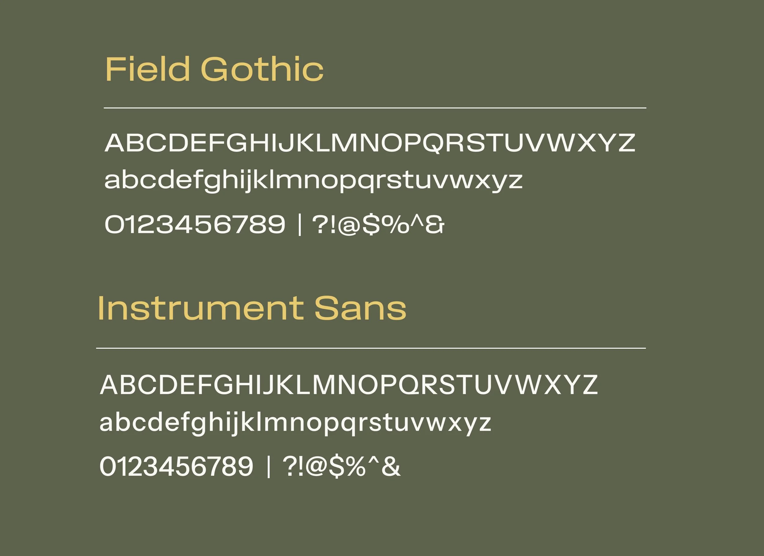
TYPOGRAPHY
I chose The Seasons for the logo and heading text, and Sofia Pro for the body text. I thought these two complimented each other well because of how similar the J’s are. The Seasons is elegant and authentic, while Sofia Pro is timeless and easy to read.