Brix Branding & Logo Design
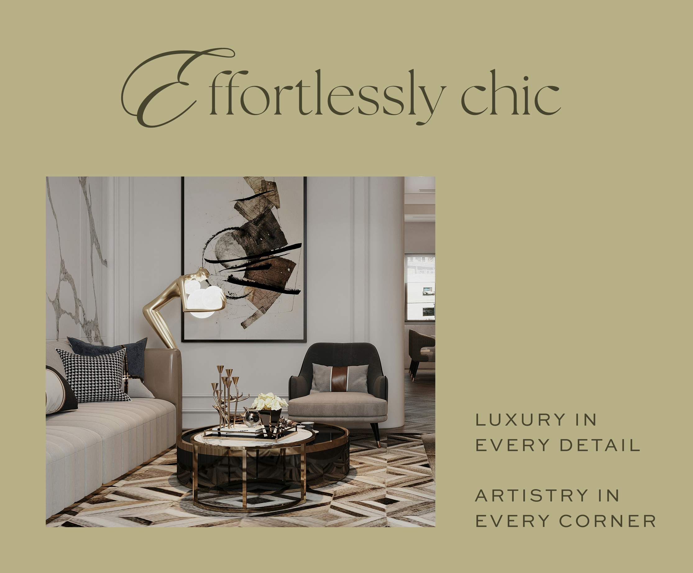
Brix is a refined living experience rooted in quiet luxury, where light, airy design meets thoughtful detail. Inspired by editorial layouts and boutique hotels, the brand feels polished, feminine, and poetic. A delicate serif wordmark and key emblem add a subtle sense of exclusivity, while the overall look balances lifestyle moments with a focus on beautiful interiors. It leans into a more expressive, layered approach while still feeling elevated and intentional.
KEYWORDS Refined, Poetic, Elevated, Luxe, Warm

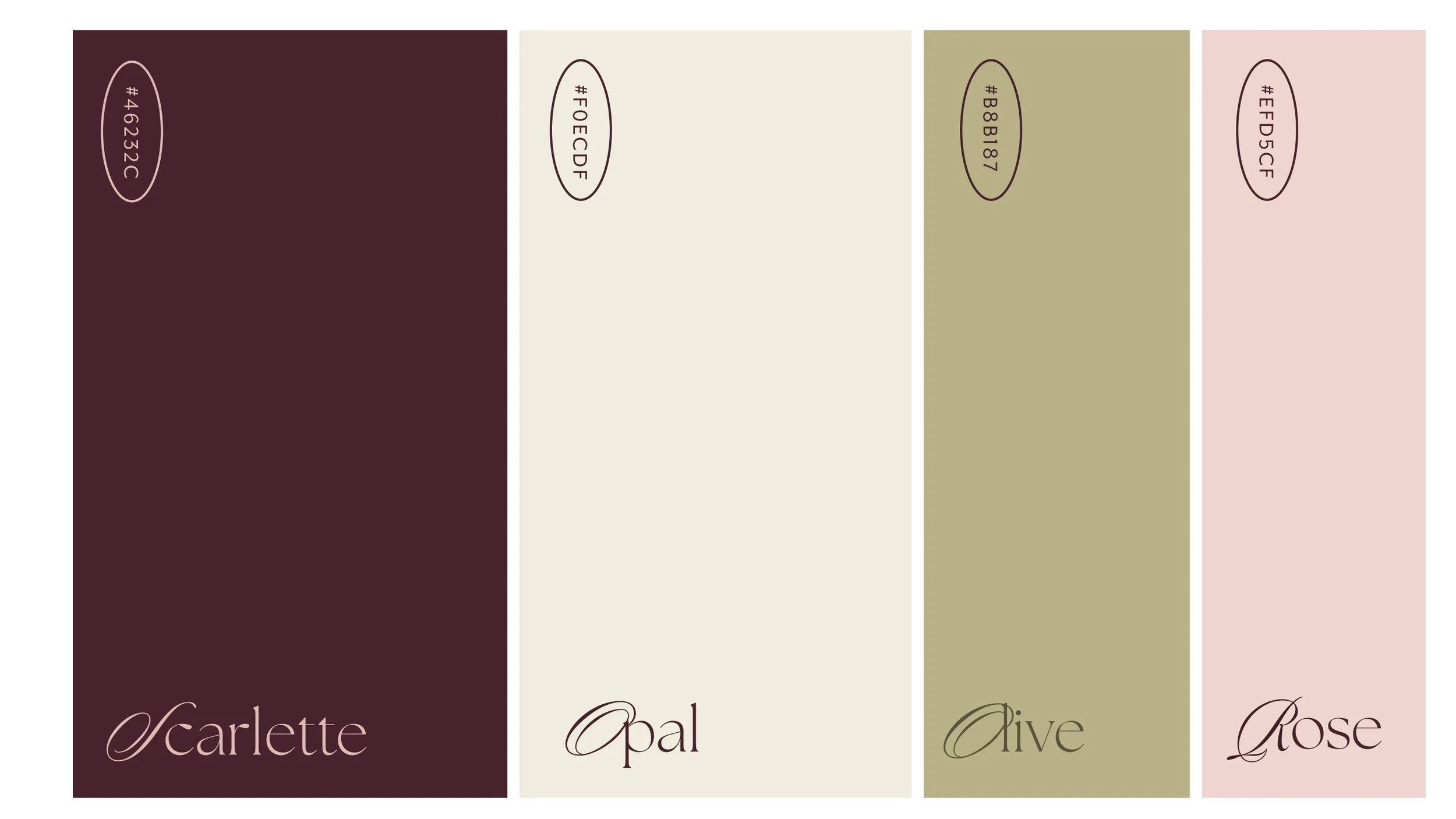
COLOR
The Brix palette balances the deep, moody weight of Scarlette with the light, stone-like tones of Opal and Olive. =
Brand Assets
The marble and black-and-white photography give the brand a solid, timeless feel. The marble adds a physical sense of luxury—like a five-star lobby—while the black-and-white images keep things looking like a high-end fashion magazine. Together, they make the brand feel both architecturally strong and effortlessly chic.